Web designing has been made easy with numerous web development services emerging over the past few years. However, there are several web designing flaws which can set you back and stop your website from getting the traffic it needs.
1. Long waits
Loading time is a very crucial factor which determines users’ experience. Most users expect a page to load in less than 2 seconds, or they’ll become more and more impatient. Finally, they’ll lose interest and leave your site before anything shows up. This is clearly not an ideal situation if you want your website traffic to increase.
2. Limited Access
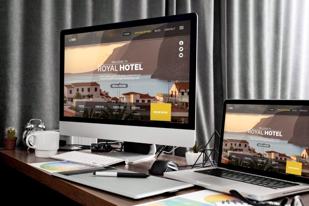
One of the most exasperating things for a visitor to face is to find out that they are not able to access a website from other devices such as through mobile phone or tablet. This blocks your site from getting the visitors it needs and could create dissatisfactions in your customers. As a matter of fact, mobile optimization is now a requirement for all website design Malaysia, as many people now own a smartphone and use it for different reasons.
3. Ignoring design test
Testing your new web design might look like a minor step, but it could tremendously affect your website performance and quality. After designing your website, you might think that it is perfect, but your customers might think differently. One of the ways to know if your web design Malaysia is excellently working is to get feedback from other real users and improve based on the responses given.
4. Too many colours
Colour is an essential part of web designing. It could set off the theme of your website, attract your customers and lead them to the right sections. However, it is important to observe the colours used in your design and make sure it is meaningful and not overwhelming for your consumers to see. The best way to utilize colours is to focus on the central message of your site and pick colours which suit it. Try complementing different colours and study the psychology of colours to create a visually pleasing website.
5. Give up usability for beauty
Some websites are beautifully designed, but it still seems not to pick up the amount of potential customers targeted. It could be due to the reduced usability of the website that was replaced by style in visual presentation. Of course, it’s not wrong to design your website to perfection. However, it is never effective if it doesn’t work well. One example of this common mistake is using light grey text on a light coloured background, which affects the readability of the text. Avoiding busy backgrounds, or insufficient colour contrast is better compared to creating a website which defeats its purpose.
Looking for more details / need help on Web Design?
NUWEB is ready to help you. Please visit https://nuweb.com.my/web-design/ or whatsapp 012-696 3011 for FREE Web Design Consultation.
